Help Users Navigate Your Application
Elon Musk says that if a user needs a manual to understand the product, the design is broken. I absolutely agree with this statement, but unfortunately clients are often reluctant to invest in the best solution due to lack of resources or budget. This is when guided tours might save their users. This is especially true for legacy software and applications.
There’s been a number of players in the design community using guided tours, from MailChimp to Facebook. This decision to add guided tours can help new users, users who might use your application so infrequently that they forget where the features are, or simply because it helps alleviate the learning process for new features or navigational changes & upgrades. If you’re making large changes to your application structure and you have a lot of current users, you may even consider rolling out the changes slowly.
Getting Started
The first step is to discover the most common tasks, and the tasks people are having issues completing. Ask your support team about common issues customers ask for help with. By adding guided tours for common issues, your support team will both become less burdened, as well as have better tools to offer to customers. Once you discover the tasks list, break each task into a series of steps. Each of these tasks can become their own tour.
There are many ways to approach guided tours. They’re especially helpful for first time and infrequent users. Here’s a few options to consider when thinking of including a guided tour.
Guided Tour Options
- Add a guided tour panel to the dashboard.
- Add a slide out help panel that users can access anywhere on the site.
- Activate a lightbox popup by the click of a button. This button could be named “Take the Tour”, “Help”, “Guide Tour”, etc…
- Include navigation for multistep tours, like a next and back button.
- Give the user an idea of how many steps your walking them through, and where they currently are in the tour. example: 1 of 5.
- Always have a close option that is clear to the user.
- Think about activating the a feature tour automatically for new features. This way you can train all user to use new features as they’re added.
- Look for a jQuery tour framework that enables multipage tours. This will give you more flexibility to launch tours from anywhere on your site, even from an email newsletter.
- Think about how the tour will work on mobile devices.
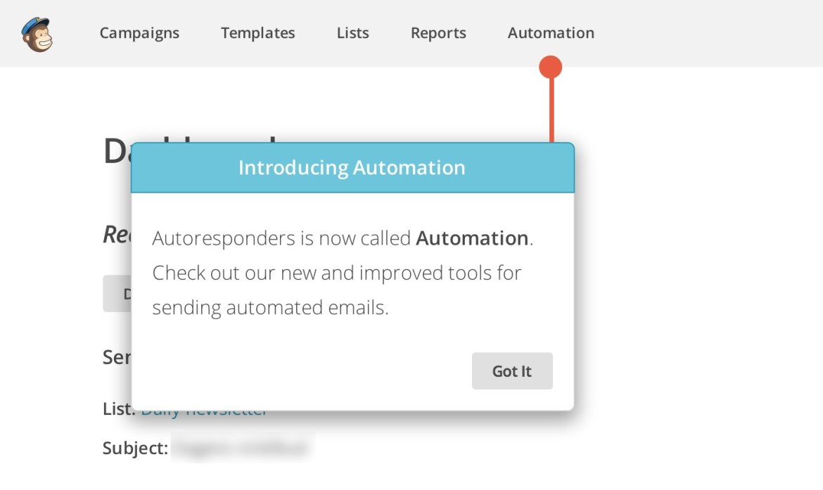
- Will the tour framework need the ability to point to detailed locations. The example used in the MailChimp screenshot at the top of this article might work best for those purposes.
Guided Tour Patterns

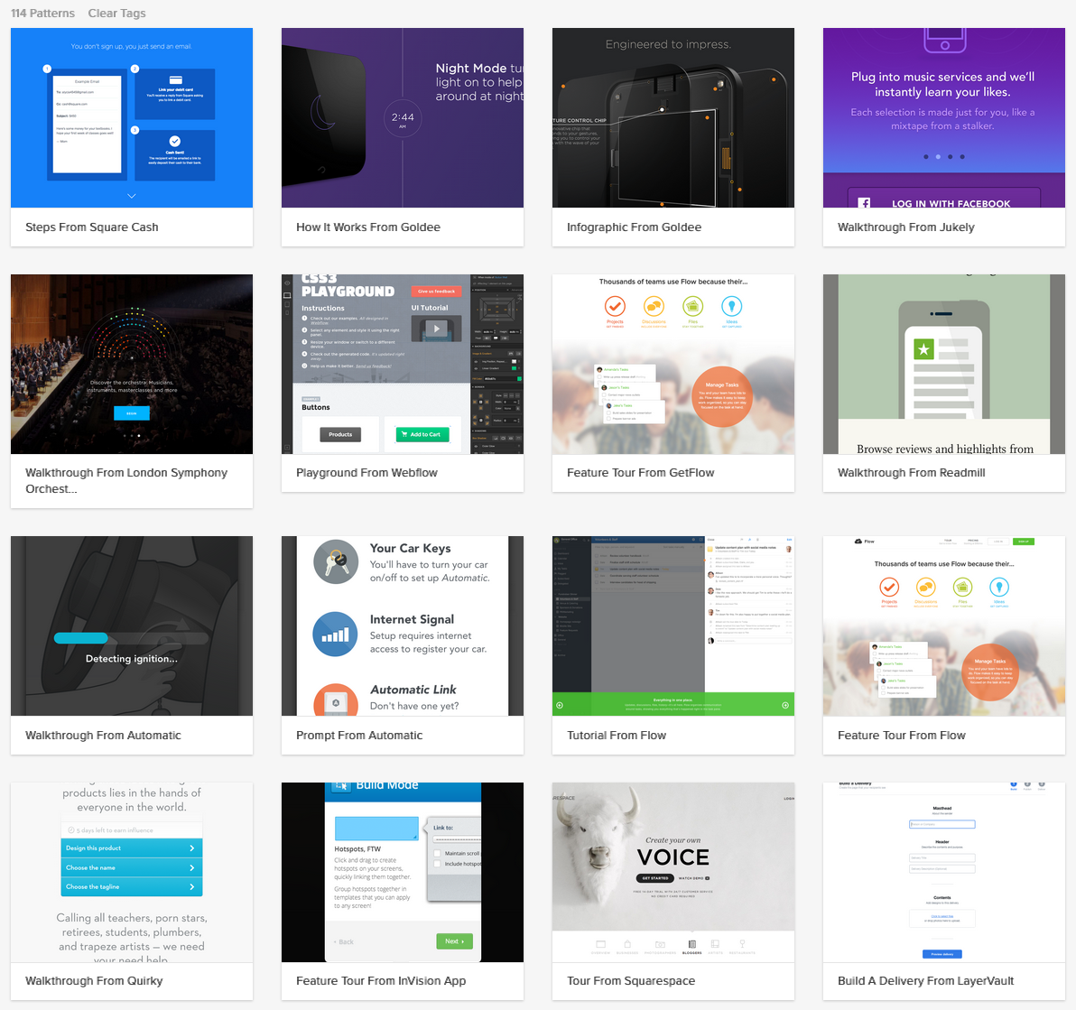
Checkout the many walkthrough patterns in ZURB’s PatternTap library.
Guided Tour Frameworks
- Hopscotch (Multipage Tour Compatible)
- Intro.js
- Product Tour by Codyhouse
- Pageguide.js
- Tutorialize (Multipage Tour Compatible)
- jQuery Impromptu
- Chardin.js
- Shepherd (uses Tether for positioning elements)
- Bootstrap Tour
- JoyRide
- jQuery Tour (Multipage Tour Compatible)
- PowerTour (Multipage Tour Compatible)
- Tourist.js
Guided Tour Frameworks For WordPress
- Sidekick
- Web Site Tour Builder For WordPress
- WP Flat Visual Chat (Live Guided Tour)


