Tearing Down Walls And Building User Interface Super Highways
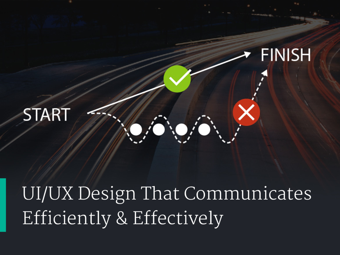
Great user interface design is about communicating information efficiently & effectively. It’s about tearing down the obstacles that get in the way. Sometimes this even means answering user questions before they’re asked, like how google guesses your question as you type.
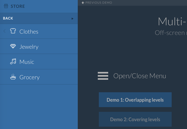
Help your users cut through the clutter and get to the information they desire. Anyone who’s worked with legacy applications are well aware of the frankensteinish navigation structures that arise when left to grow organically. When left unchecked these old navigation structures start to lose efficiency and effectiveness. To fix this is a reexamining of the bigger picture, and realignment with user goals is necessary.
Research Time
- Examine site structure and hierarchy.
- Think about common tasks and which task users have trouble accomplishing.
- Consider process and steps users need to make to complete tasks.
- Give users access to key information by adding relevant and informative data to the navigation and interface elements.
- Add help features that actually help the user understand the interface. Use guided tours and tooltips that point out where ui elements live. Think about adding a slide in help section or popup.
- Review user interface patterns that solve similar problems. Look on Pinterest,sites like PatternTap or just plain Google it.
- Get others involved. The more people you have reviewing your plans, the more opportunity they have to poke holes. This is a good thing. You want your team to find the flaws and to suggest improvement early on before things go to deep. The earlier you can involve others in your team and client involvement the better.
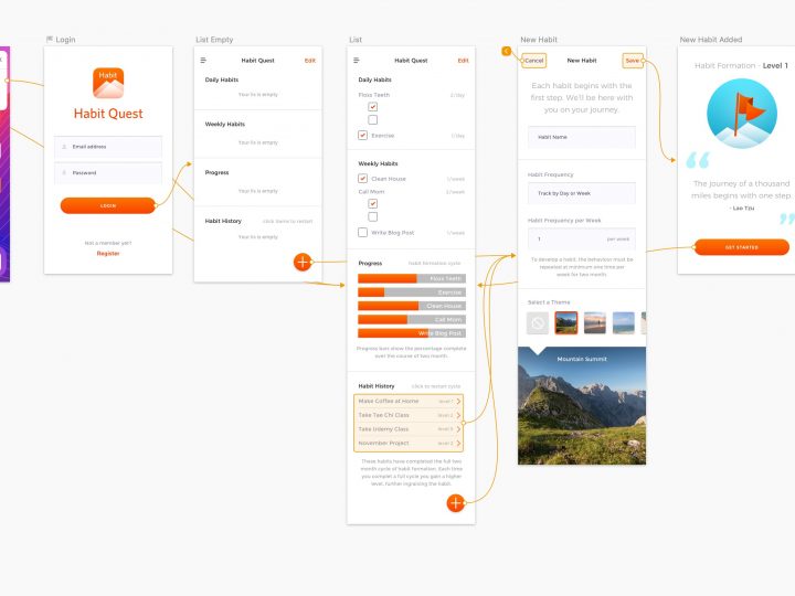
- Create wireframes. Create low fidelity wireframe mockups. We don’t want people to focus too much on design styles at the beginning of the process. It’s more important to workout the structure and functionality.
- Have people review the low fidelity wireframe mockups. And iterate quickly.
- Build a low fidelity wireframe mockup and have people start interacting with it. Get people to collect their comments, of what they liked and where they had issues. There’s some great option in the market for building prototypes and testing.
- Test, test, test!
My Favorite Prototyping Frameworks
- InVision App. This online framework lets you build interactive prototypes, perform user testing, present internally or to clients, manage reviews and comments internally and with clients, and just overall manage your projects from start to finish.
- Marvel App. This online framework also lets you build interactive prototypes, perform user testing, present internally or to clients, manage reviews and comments internally and with clients, and just overall manage your projects from start to finish.
- Keynote. Great for building out interactive videos, PDFs, and other mockup collateral like images, animated GIFs for using with InVision App or Marvel App.
- Just plain HTML, CSS, and Javascript coding. If you don’t want to use one of the top framework options, just build out your own interactive mockup. If you have some decent coding chops, this can be quite easy. There’s a number of UI boiler plate frameworks and libraries. This is also true for javascript libraries that allow you to do almost anything under the sun. Take a look at Codrops or jQuery Rain for inspiration. You can also just Google UI Frameworks or Javascript libraries. You can also use this library by w3schools to import html elements for mockup purposes. This would let you breakup your html and css into components to quickly and easily build a web design. Then sharing code with developers is made easy since each component is already it’s own file.
- Sketch 3. This app can now be used with Craft or it’s own inbuilt preview to demo interactive mockups, or share them with clients or for user testing using the Sketch cloud service. One of the best parts of Sketch is the huge array of extensions for other applications like InVision, Zeplin, PaintCode, etc…
- Adobe XD. Adobe has it’s own competitor to Sketch with much of the same functionality. The nice part about Adobe XD is that it’s all the familiar short codes and conventions your already used to with the creative suite. They also make demoing interactive prototypes easy, both locally and remotely.
- Framer. This application is growing in popularity. Built on React I’m sure they will be a main competitor in UX tool space.
- Balsamic. This tool is great for easy low fidelity mockups. With easy drag & drop libraries to select elements, this is a great starter tool for UX design.
- Axure RP. This is a more robust low fidelity mockup tool. It makes adding simple logic, and interactive fields very straightforward. A great to tool to user for user experience testing, as you can mockup simple functionality to demonstrate future desired functionality.
- Xcode Storyboards. It’s actually surprisingly easy to use the Storyboards in Xcode. And now with auto layout it easy to build out layouts that will work across various device sizes. A combination of Storyboards and web view could make for a powerful prototyping combo.
My Favorite Tools For Building User Interface Elements & Mockups
- Sketch 3. Great for actually building out your user interface designs.
- Adobe XD. Many of the elements I like from Sketch with the familiarity of being an Adobe product.
- Illustrator. Great for building assets.
- Photoshop. Great for tweaking photo and graphic assets.
- Keynote. Great for building out interactive videos, PDFs, and other mockup collateral like images, animated GIFs for using with InVision App or Marvel App.
- Quicktime Pro. If you want to quickly and easily trim a video you want to convert to an animated GIF asset for use in InVision App or Marvel App.
- PicGIF for Mac. Easily and quickly converts videos to animated GIFs. Gives you a lot of control over frame rates and sizing.
- After Effect and Adobe Premiere. Video editing. If you want to tweak your video, or add transitioning effects to the video.


