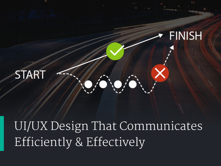
Navigation: Where Users Interface With Information Architecture
Navigation is one the most fundamental elements of any application. It gives structure to help the user understand what elements go together. Navigation also dictates process, showing the user what steps go before, what steps they have access to, and unlocking options only after certain steps take place. Navigation gives the designer control of the user experience through information architecture.
There’s so many options to consider when setting up navigation for your users. I’ve compiled a few navigation options with reference links to help you get inspired.
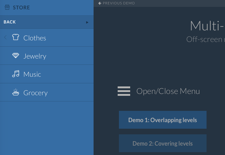
Triggered Navigation
Triggered navigation. This option hides the navigation until the user interacts with a button trigger. We see this option often used with the hamburger icon, or another launch button.
- Slide in panel. This panel could slide in from the top, left, right, bottom, or other more advanced animation transition.
- Advance animated transition. This could include a flip, spin or any other more advance animated transition to show the navigation panel.
- Offcanvas menu. This when the main content is shifted, usually pushed aside by an element out of view. This can be similar to a slide in panel.
- Lightbox popup. Although lightbox popups are primarily used for images, the flexibility they give a designer should not be underestimated. They allow for overlays of content at the touch of a button. They can be implemented into any system, including legacy applications that lack adequate navigation systems.
- Examples:
Top Banner Navigation
This is the most popular, usually living on the top row of the interface.
- Dropdown navigation. Banner navigation usually uses dropdown navigation to allow the user to dive into deeper sub-navigation.
- Mega dropdown navigation. This allows the user to see more detail at once. Often containing multiple rows. The benefit to this is to show more information at once. This is an ideal option for larger sites. This also allows for showing and highlighting graphics that help engage or highlight options using visual hierarchy.
- Often times, top banner navigation collapses out of sight on mobile devices. You may want to consider one of the triggered navigation options mentioned above for those cases.
Scroll Triggered Navigation
This kind of navigation can be intrusive, so be careful. It’s often used on blogs to encourage the user to read a similar article or event to advertise a related product.
- Examples:
So, as you can see there’s many options to choose from. You should think carefully about what kind of navigation your showing and where the navigation will be used. Is the navigation going to be used on mobile? If so then a slide in navigation triggered by a hamburger icon on mobile device might work great. If user are trying to navigate to main elements on a desktop, displaying that menu front and center on a top banner will probably make the most sense. Think about common navigation conventions to help ease the user. But if there is an opportunity to use more innovative strategies which are new, but will improve on the navigation experience, those options should be considered and tested.